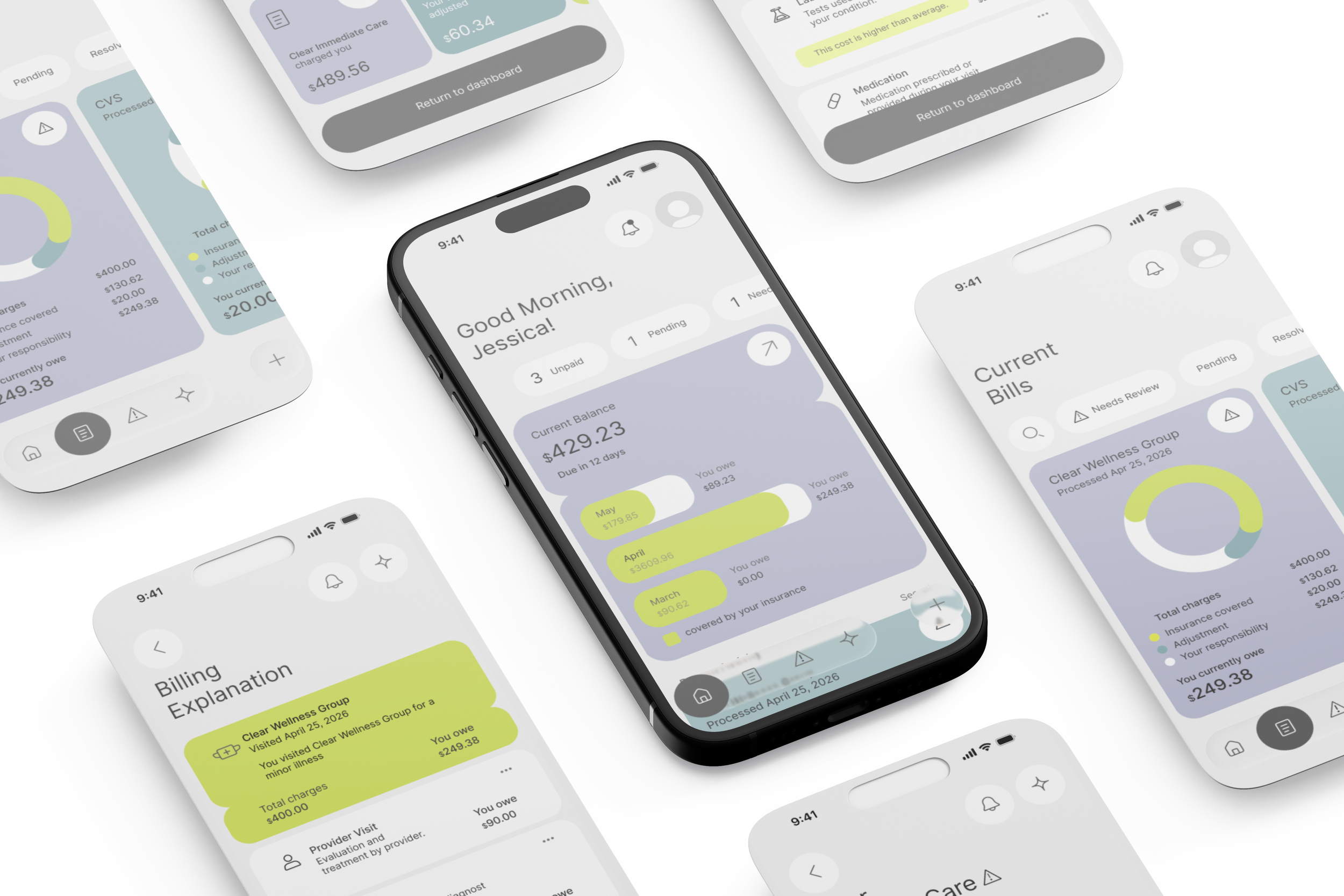
CLARIO OVERVIEW
As a designer, my goal was to create an app that simplifies medical billing in the U.S. by helping users understand complex medical expenses, identify potential billing errors, and navigate disputes.
You shouldn't need a healthcare expert to understand what you owe.
Category: Healthcare/Finance
Scope: UI/UX, Prototyping, Design system
Duration: 4 weeks
Tool: Figma, Adobe Suite
LISTENING BEFORE SOLVING
Problem: Medical bills are difficult to understand and even harder to trust.
ONBOARDING EXPERIENCE - ENG.
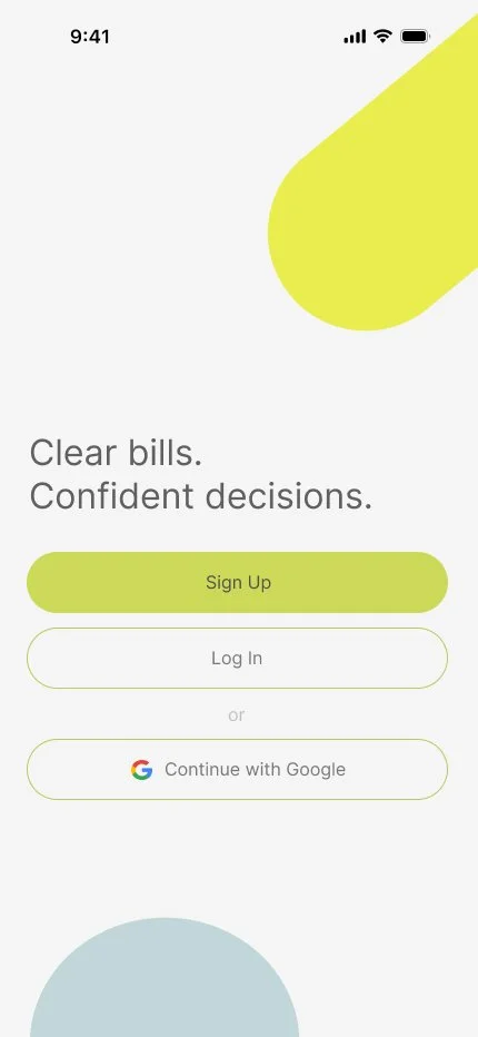
Getting started with Clario, made simple.
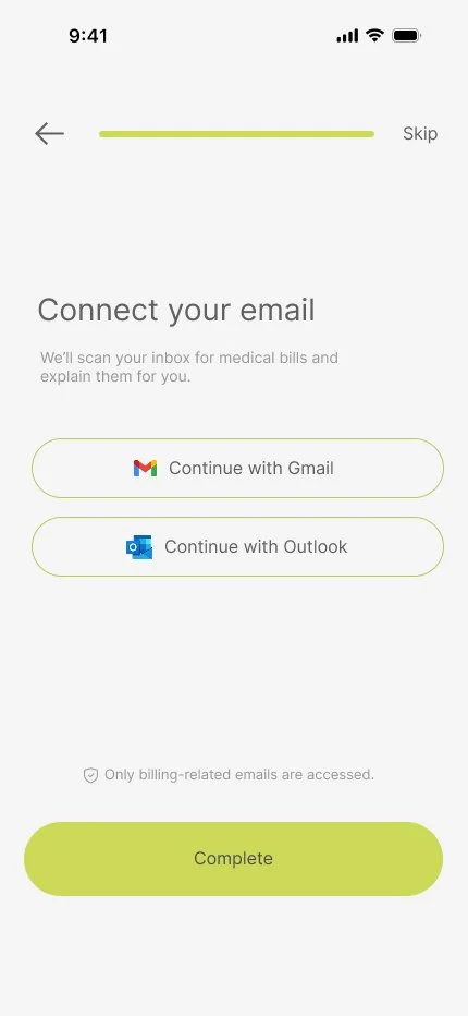
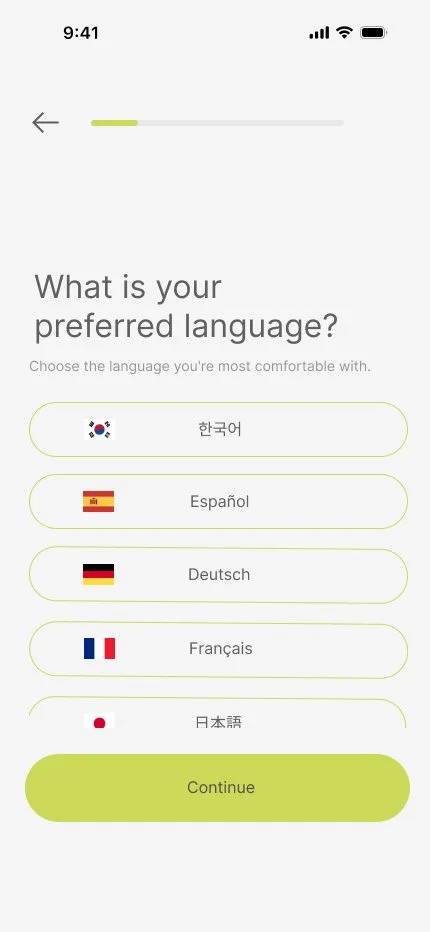
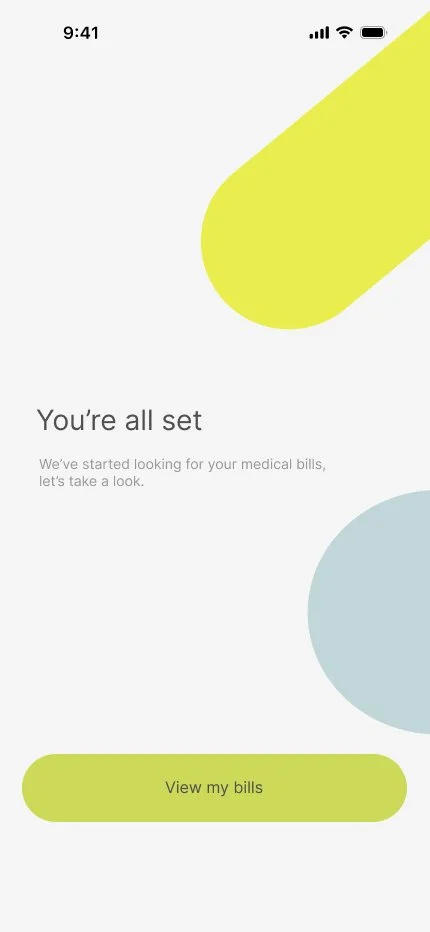
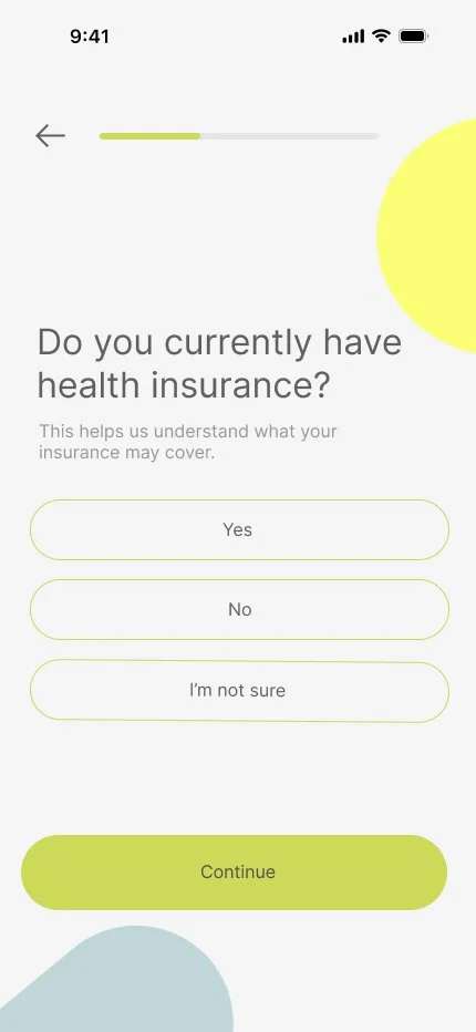
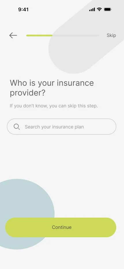
After developing a clear design system, I translated the system onto an onboarding experience. Rather than overwhelming first-time users with a lengthy form, Clario breaks the setup process into manageable questions to make information collection faster and more intuitive.
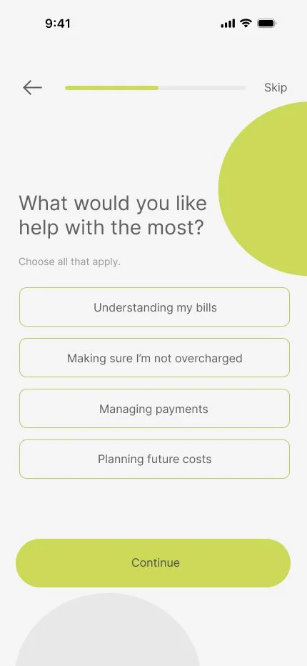
Prototype Walkthrough
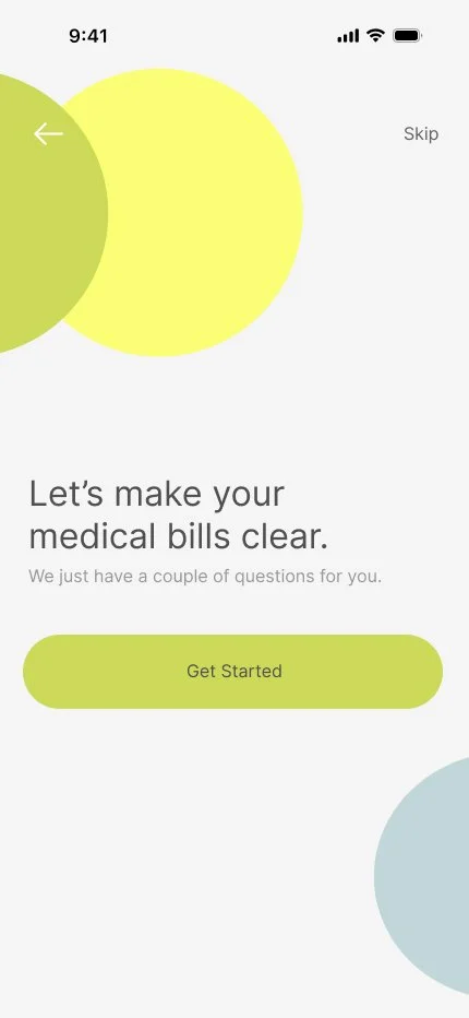
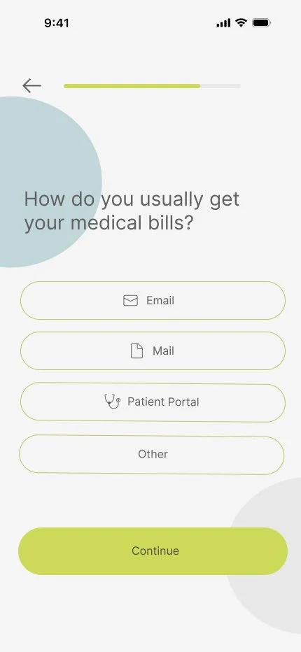
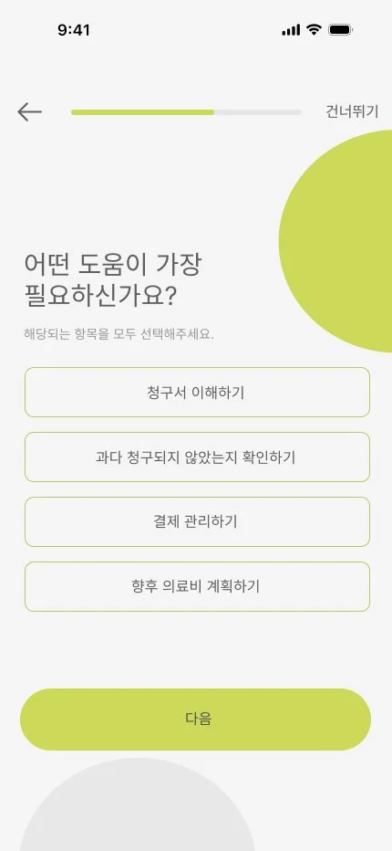
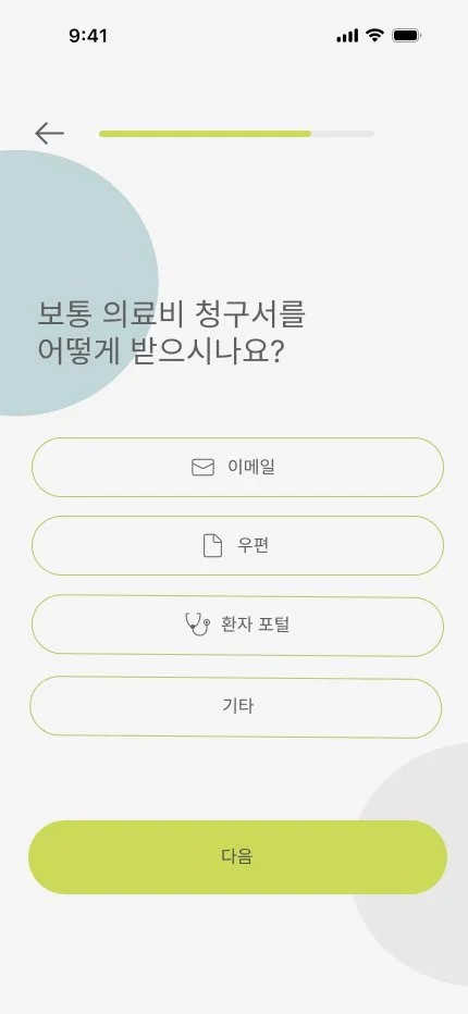
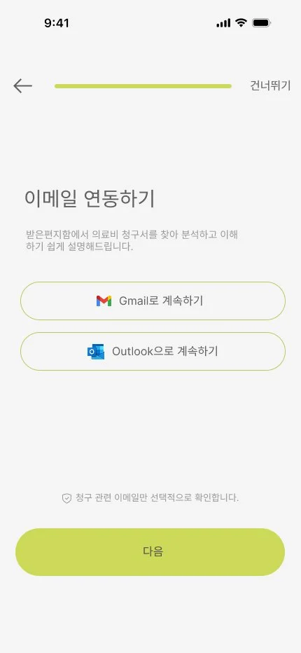
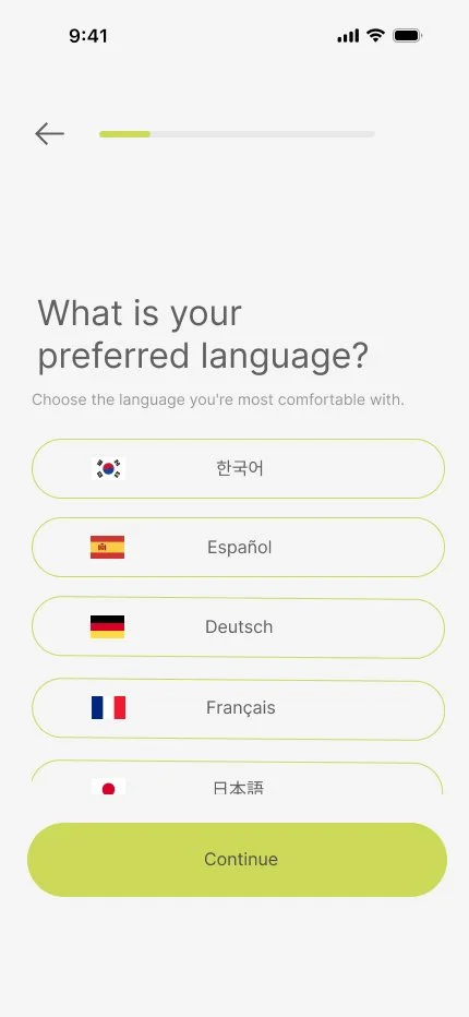
To make onboarding more accessible, Clario allows users whose first language is not English to select their preferred language during setup, ensuring a more comfortable and intuitive experience.
Key Features of Clario
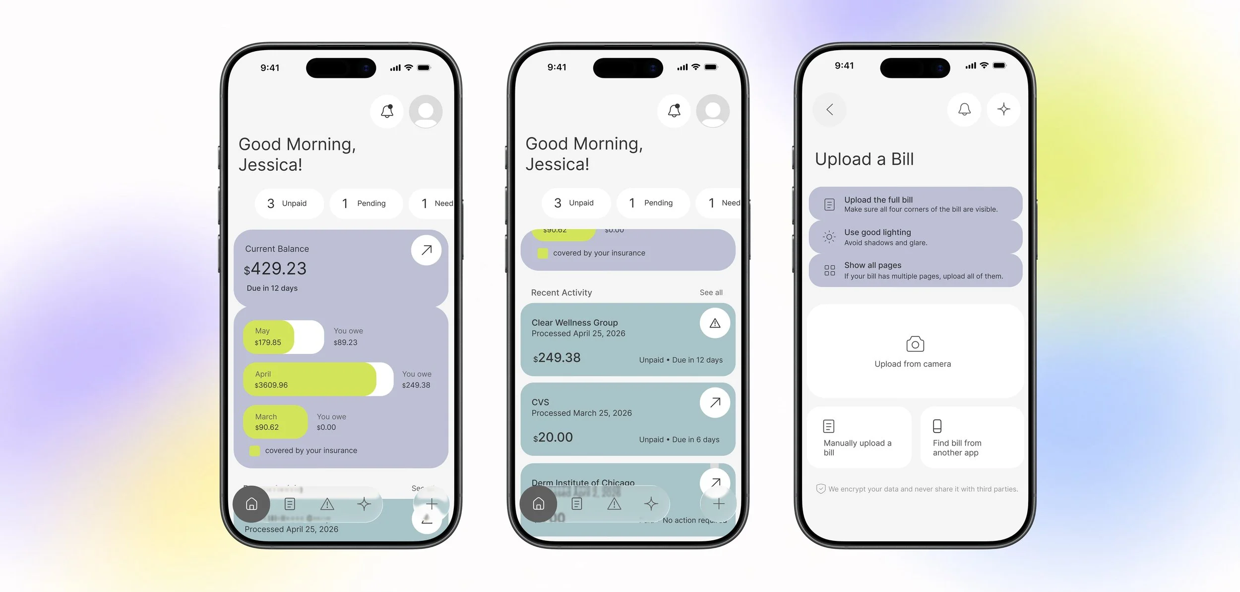
Flow 1: Dashboard & Bill Management
At a glance, users can track their medical expenses, including unpaid balances, insurance coverage, and bills flagged for potential disputes. For bills that aren't automatically imported into Clario, users can easily upload them manually.
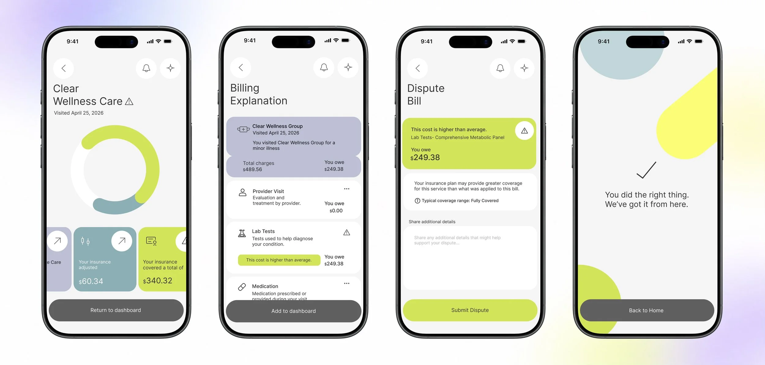
Flow 2: Bill Breakdown & Dispute
Users can easily understand their medical bills through a clear breakdown of charges, insurance coverage, and outstanding balances. Clario flags potentially incorrect charges and allows users to submit disputes directly through the app.
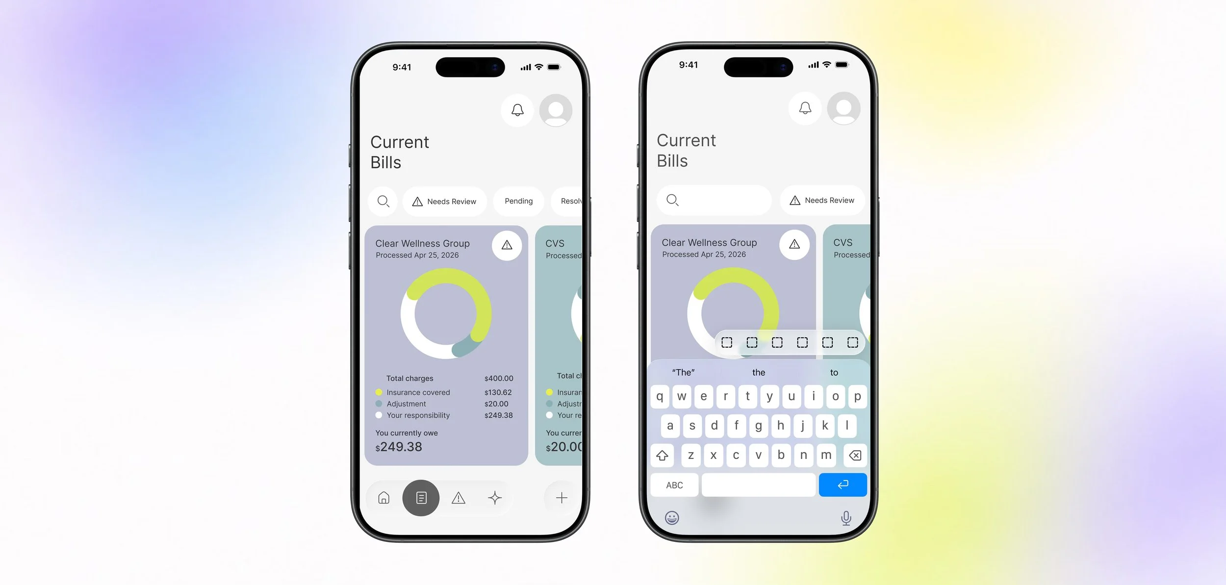
Flow 3: Current Bills & Bill Tracking
Users can view all their uploaded medical bills in one centralized place. Bills are organized by status, allowing users to quickly identify those needing review, pending payments, or resolved charges. A search and filter function makes it easy to locate specific bills and manage their billing history.
Bringing Clario to Life
A demonstration of how users navigate Clario's features, from bill submission to dispute resolution.
01. Balancing Engagement with Credibility
I learned how to incorporate engaging visual elements and interactive UI patterns while also maintaining a professional, trustworthy aesthetic. I designed with the idea in mind that in healthcare, visual design needs to feel approachable without compromising user trust.
User Interview 2
A language barrier makes disputing bills harder.
Sarah · Experience navigating medical bills with immigrant parents
“I got charged almost $40,000 for my back surgery with insurance and it wasn’t even correct. I had trouble understanding what they billed me because they throw around terms like I went to med school”
Typography
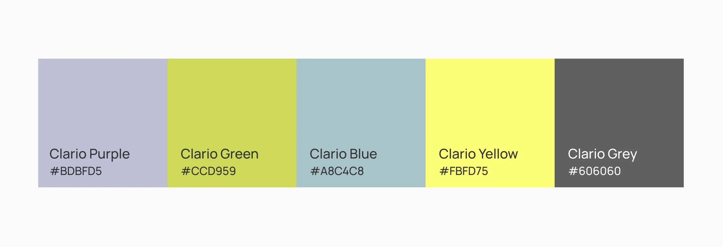
Color
To better understand the challenges people face when navigating medical bills in the U.S.,
I conducted user interviews to identify common pain points.
User Interview 1
A $40,000 bill she couldn’t make sense of.
Zoe · Experience navigating medical bills after back surgery
“I got charged almost $40,000 for my back surgery with insurance and it wasn’t even correct. I had trouble understanding what they billed me because they throw around terms like I went to med school”
KEY INSIGHT
01. Medical bills lack clarity and transparency.
Complex billing terminology and unexpected charges make it difficult for users to understand what they owe, recognize how much their insurance covers, and challenge any potential billing errors.
02. Disputing charges is difficult to navigate.
Language barriers and the need to contact insurance directly make challenging unfamiliar charges stressful and inaccessible for some users.
INTRODUCING CLARIO
Solution: making medical bills easier to understand and easier to trust through automated bill analysis and clear, actionable guidance.
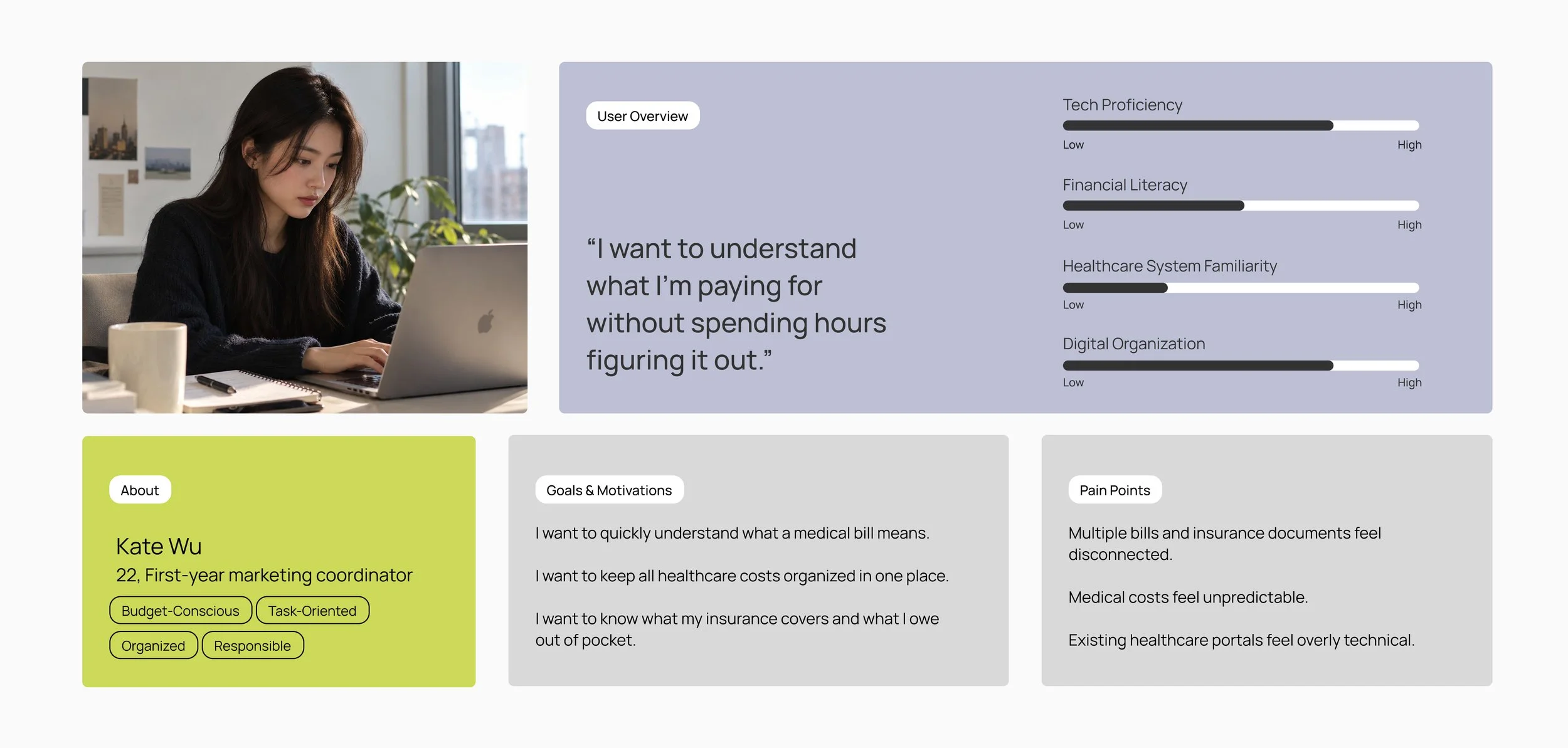
WHO ARE WE DESIGNING FOR?
Solution: making medical bills easier to understand and easier to trust through automated bill analysis and clear, actionable guidance.
COMPETITIVE ANALYSIS
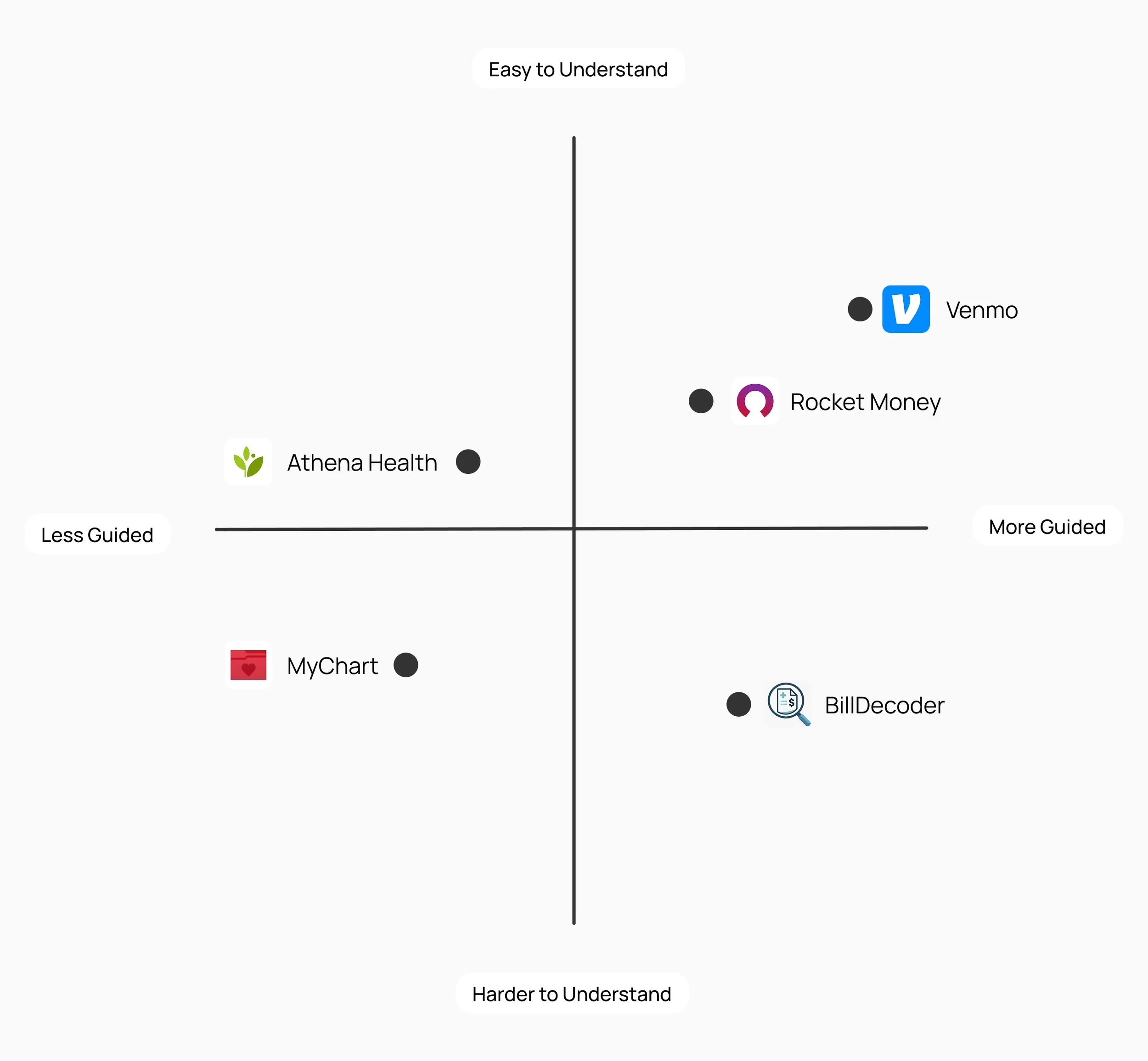
What existing apps do well and where opportunities exist.
I analyzed five healthcare and finance apps to understand how they deliver complex information and guide users toward action.
By comparing ease of understanding and level of guidance, I identified opportunities to make medical billing feel more approachable and easier to navigate.
Opportunities to stand out:
01.Translate confusing medical terminology and billing details into clear, digestible explanations.
02.Go beyond displaying bills by helping users understand what needs attention and what actions they can take.
03. Highlight potential billing issues and explain why a charge may need review, without assuming every flagged charge is an error.
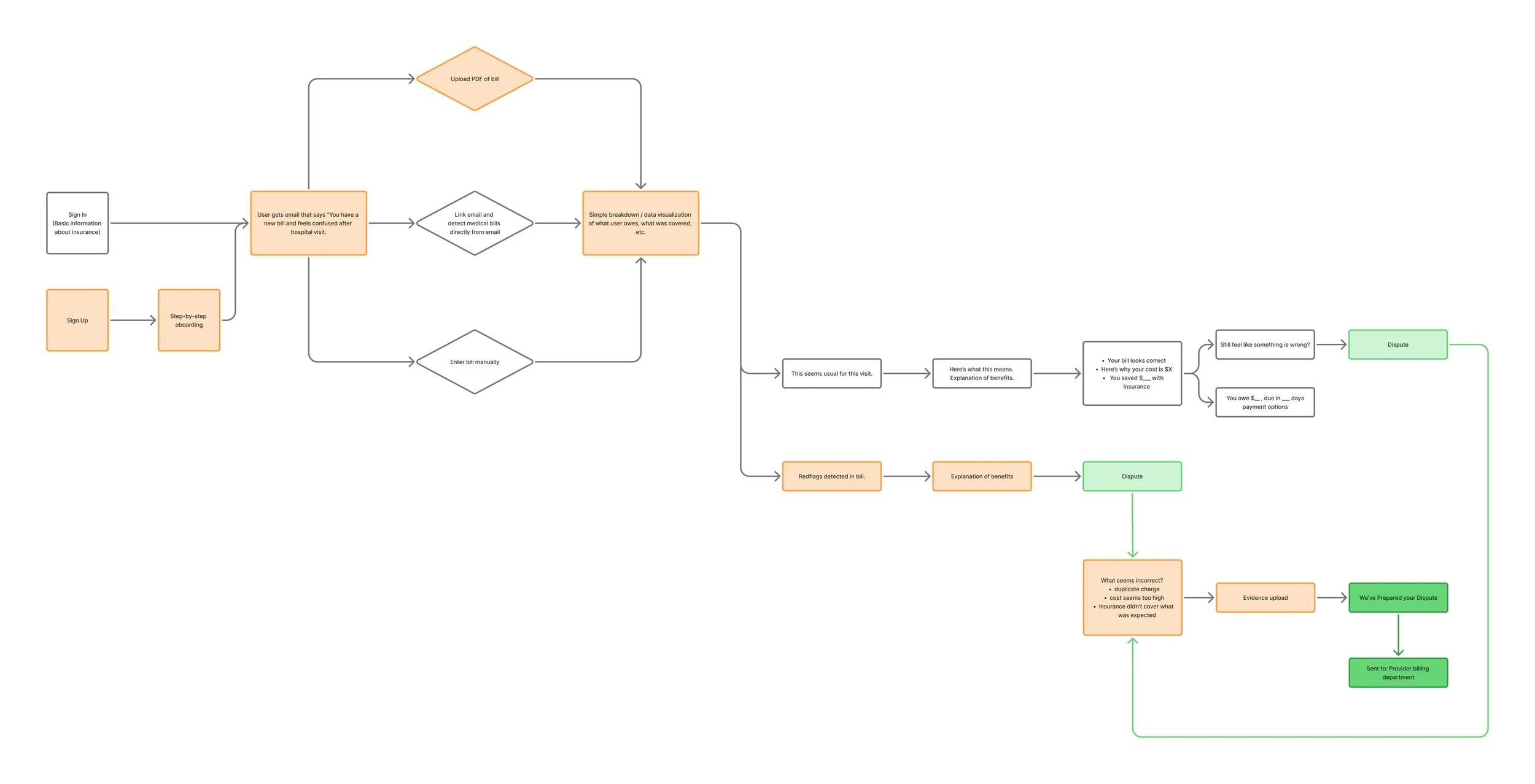
USER FLIGHTPATH // click for closer viewing
Mapping out a user flow.
I began with mapping the user's journey from receiving a medical bill to understanding the charges and determining the next steps. This helped me identify opportunities to simplify navigation and make the process more efficient.
IDEATION
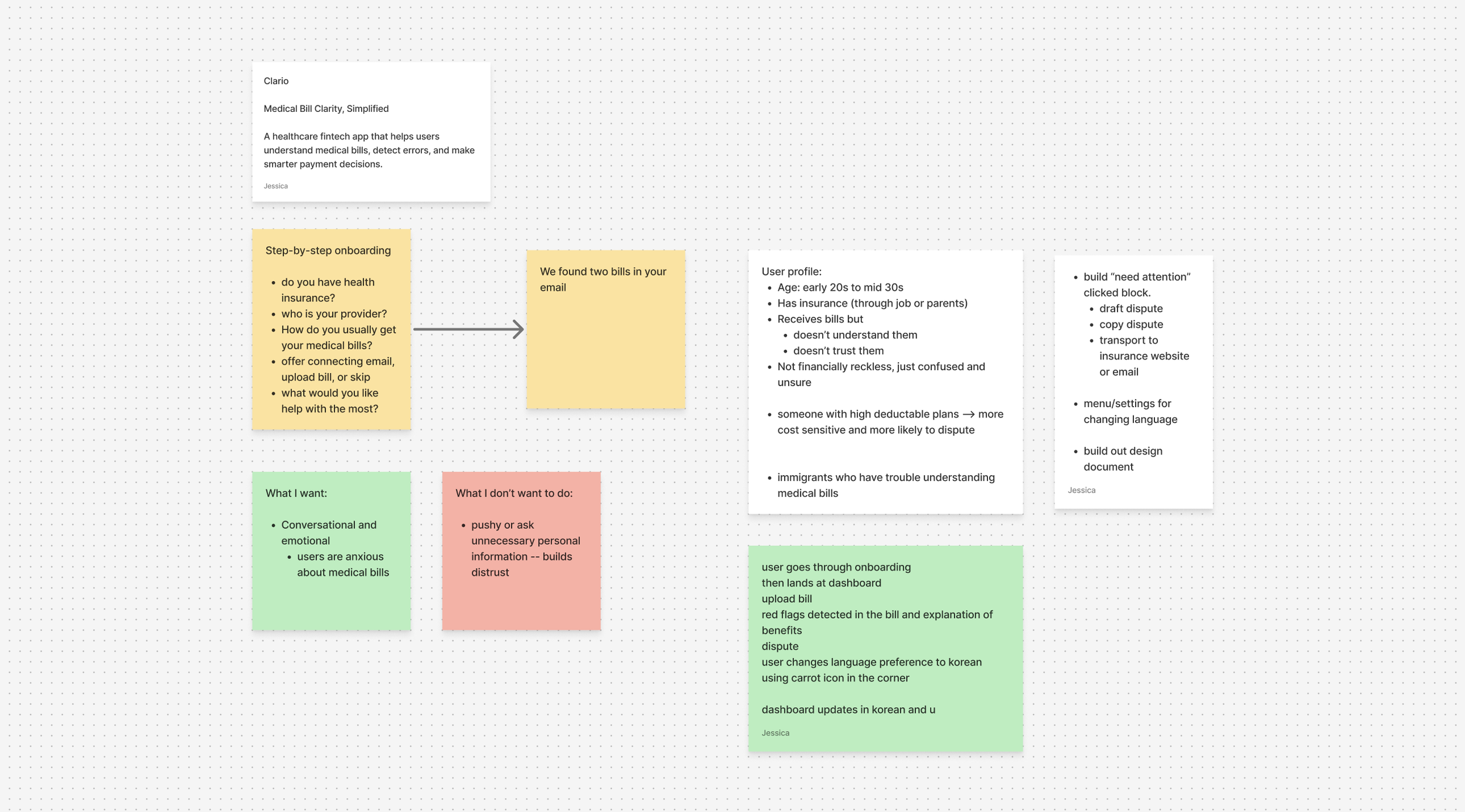
Defining goals and key features.
I outlined my overall goals and the key features I wanted to develop. These initial notes served as a reference point throughout the design process, helping me stay focused on the product’s core goals as I built out each feature.
BRAND IDENTITY
VISUAL IDENTITY AND BRANDING
Establishing a visual language.
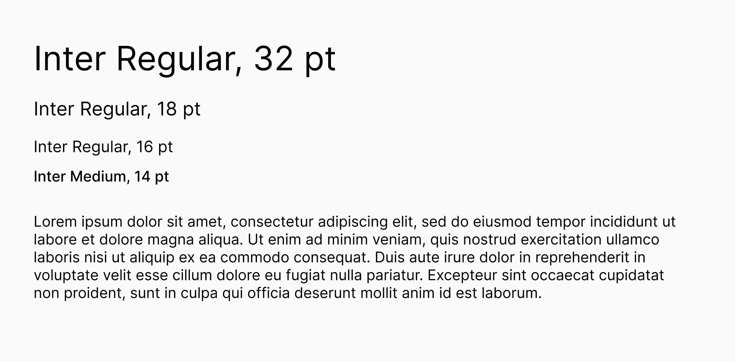
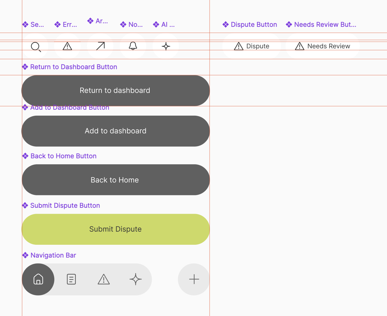
I developed Clario’s visual identity around clarity, approachability, and trust. A clean typographic system, a distinctive color palette, and simple iconography work together to make complex topics feel more approachable. Each element was designed to support clear information hierarchy and help users navigate the experience with confidence.
Design Components

02. Integrating AI with Purpose
By incorporating features such as AI bill scanning, I learned that AI capabilities can simplify complex processes and make information more accessible. This project helped me understand how AI can enhance the user experience while keeping users in control of their decisions.
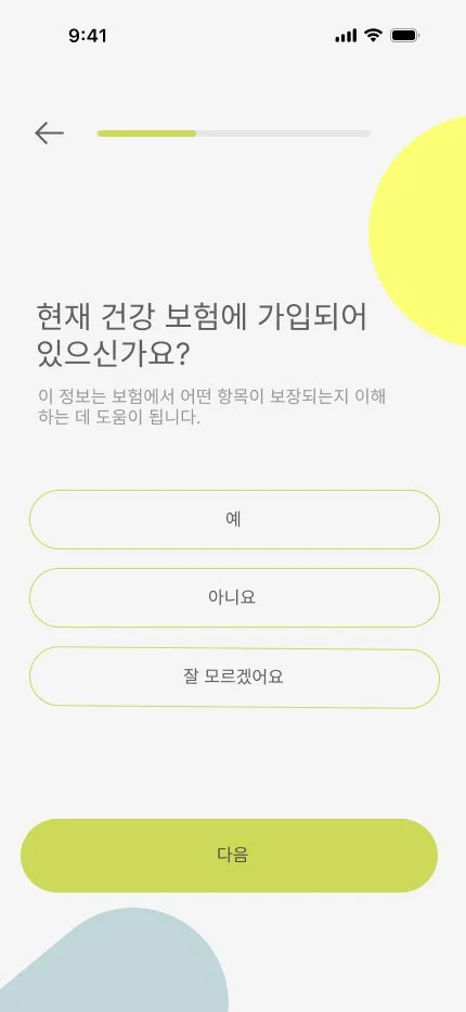
Onboarding in Korean

Key Takeaways